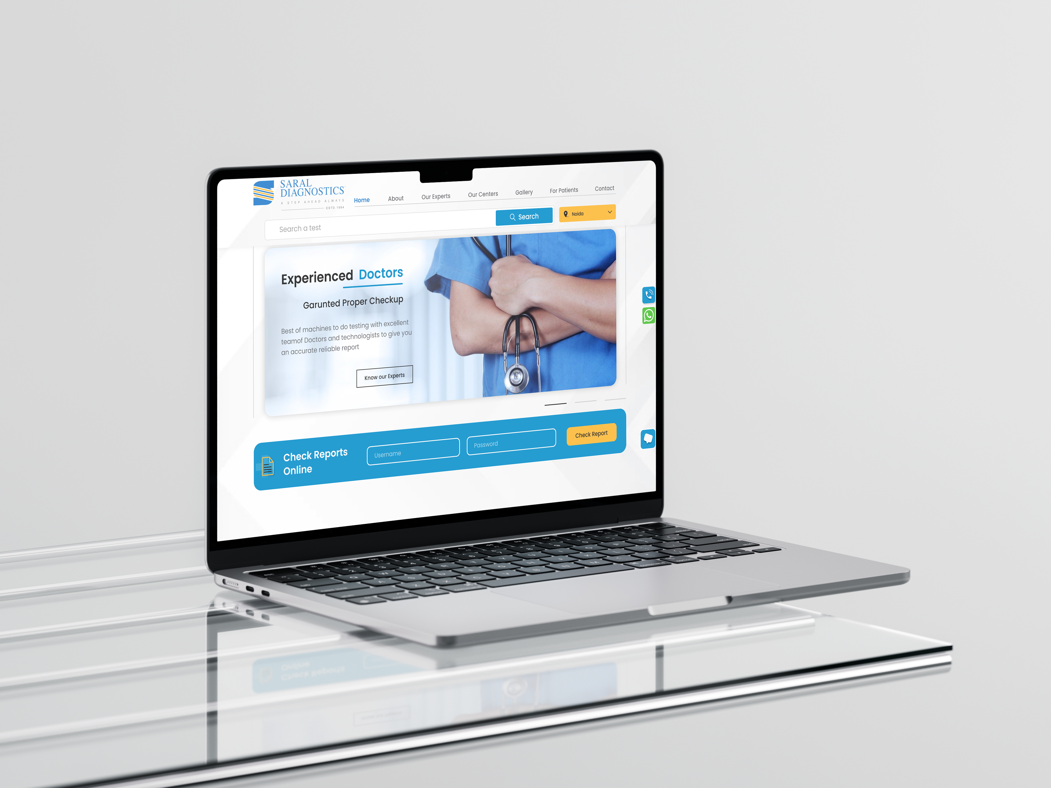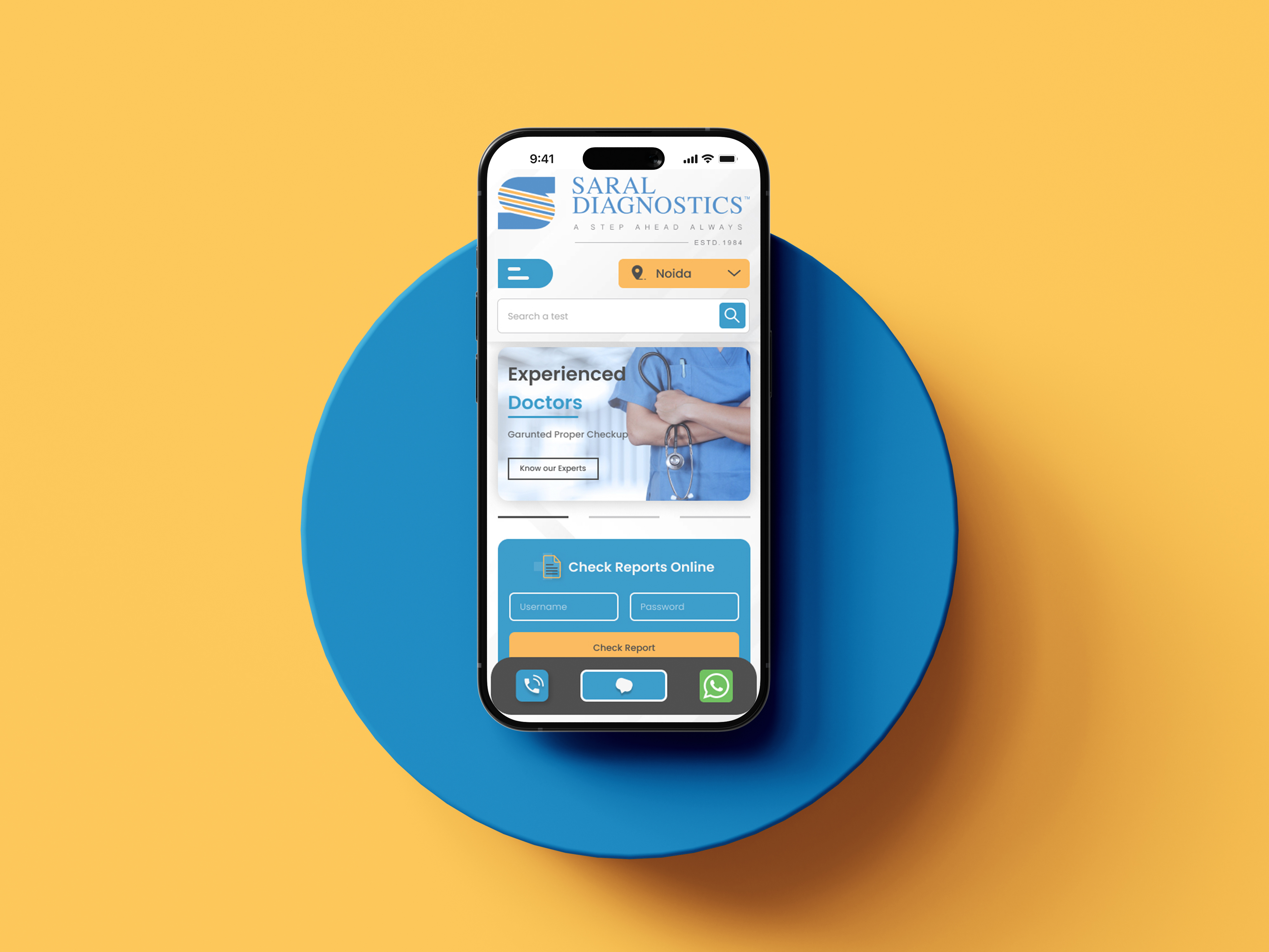


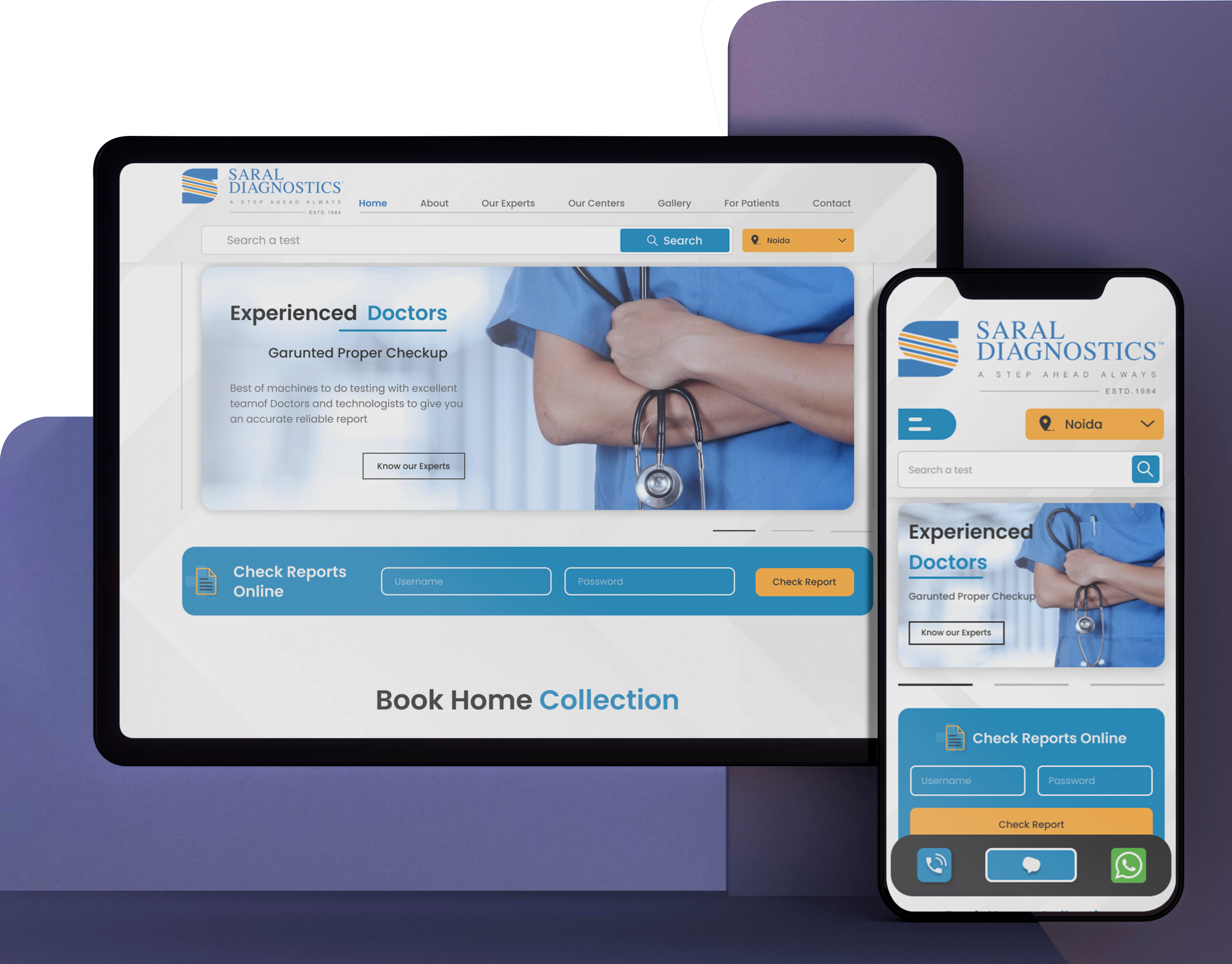
Saral Diagnostics
Saral Diagnostics is a long-established, reputable diagnostic service provider in India, especially in Delhi and Noida. Backed by credible accreditations and a broad range of services—from advanced imaging to pathology—it emphasizes convenience, quality, and accessibility for patients.

Industry:
Medical Testing &
Laboratory Services

Role:
UX Research &
Design Responsive UI

Tools:
Figma, FigJam &
Adobe Photoshop
Overview
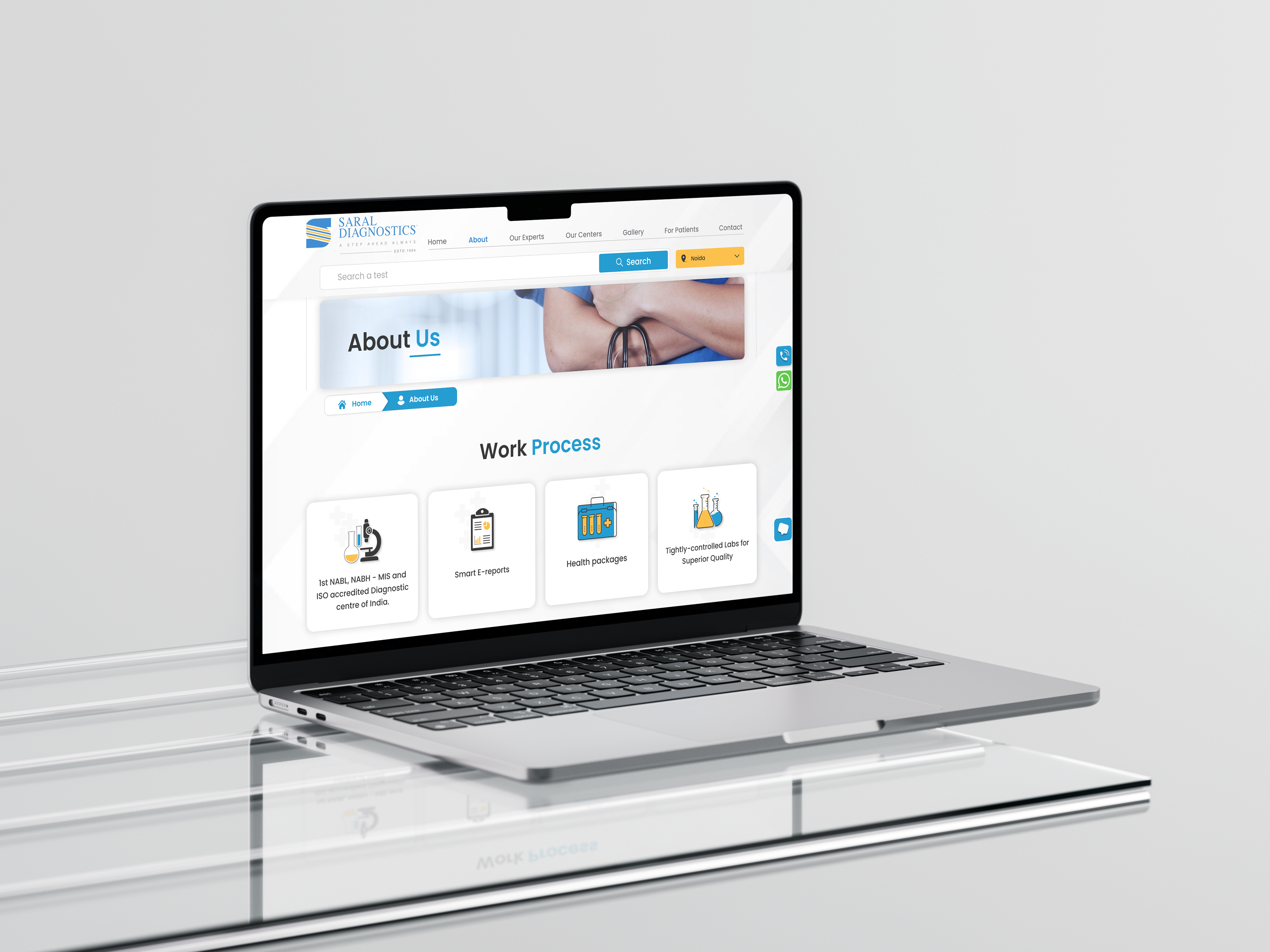
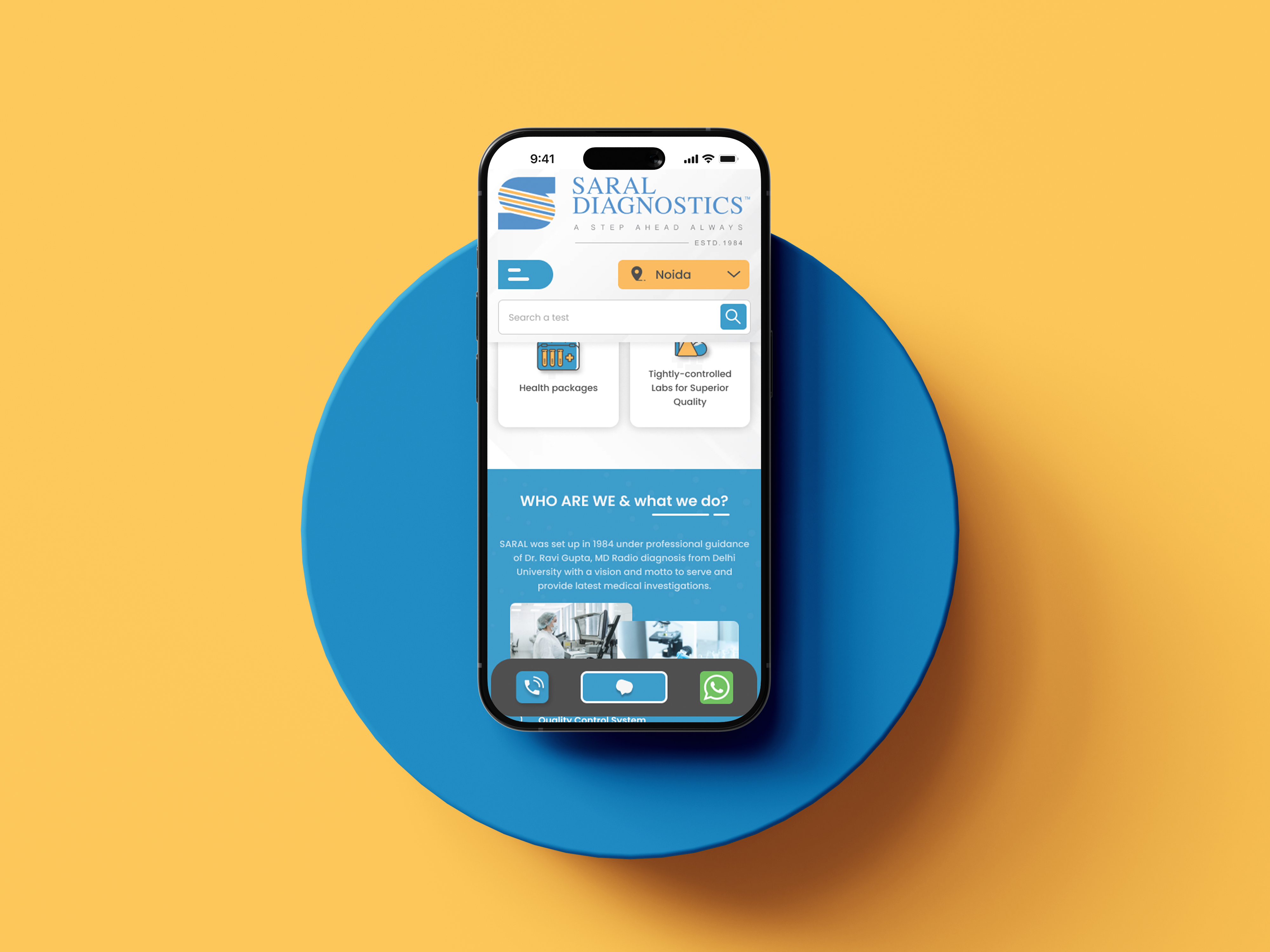
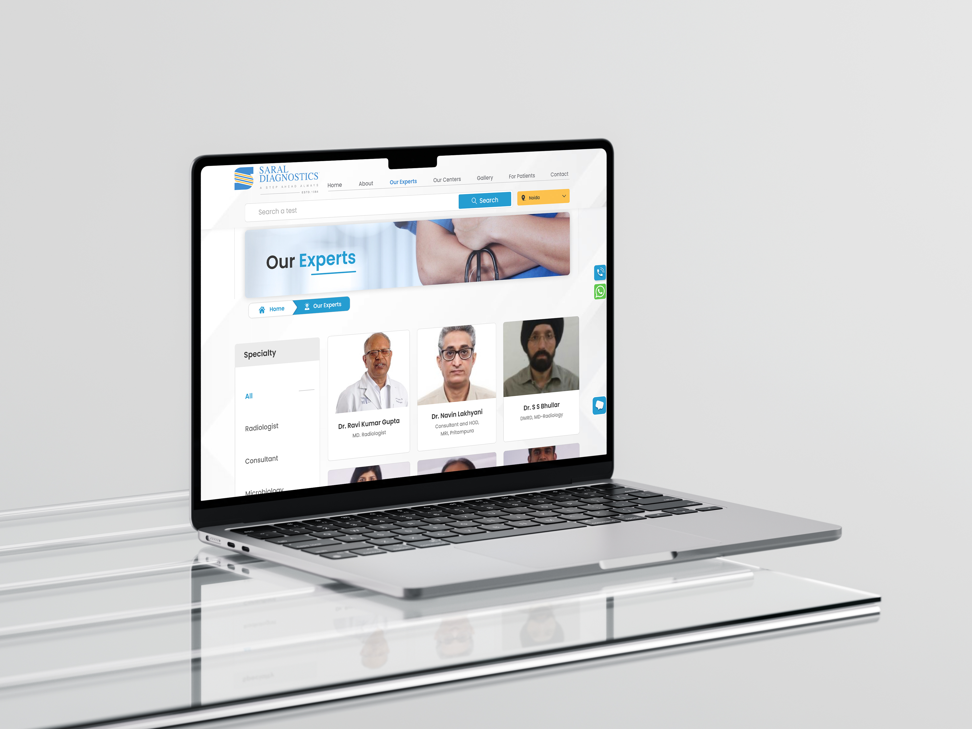
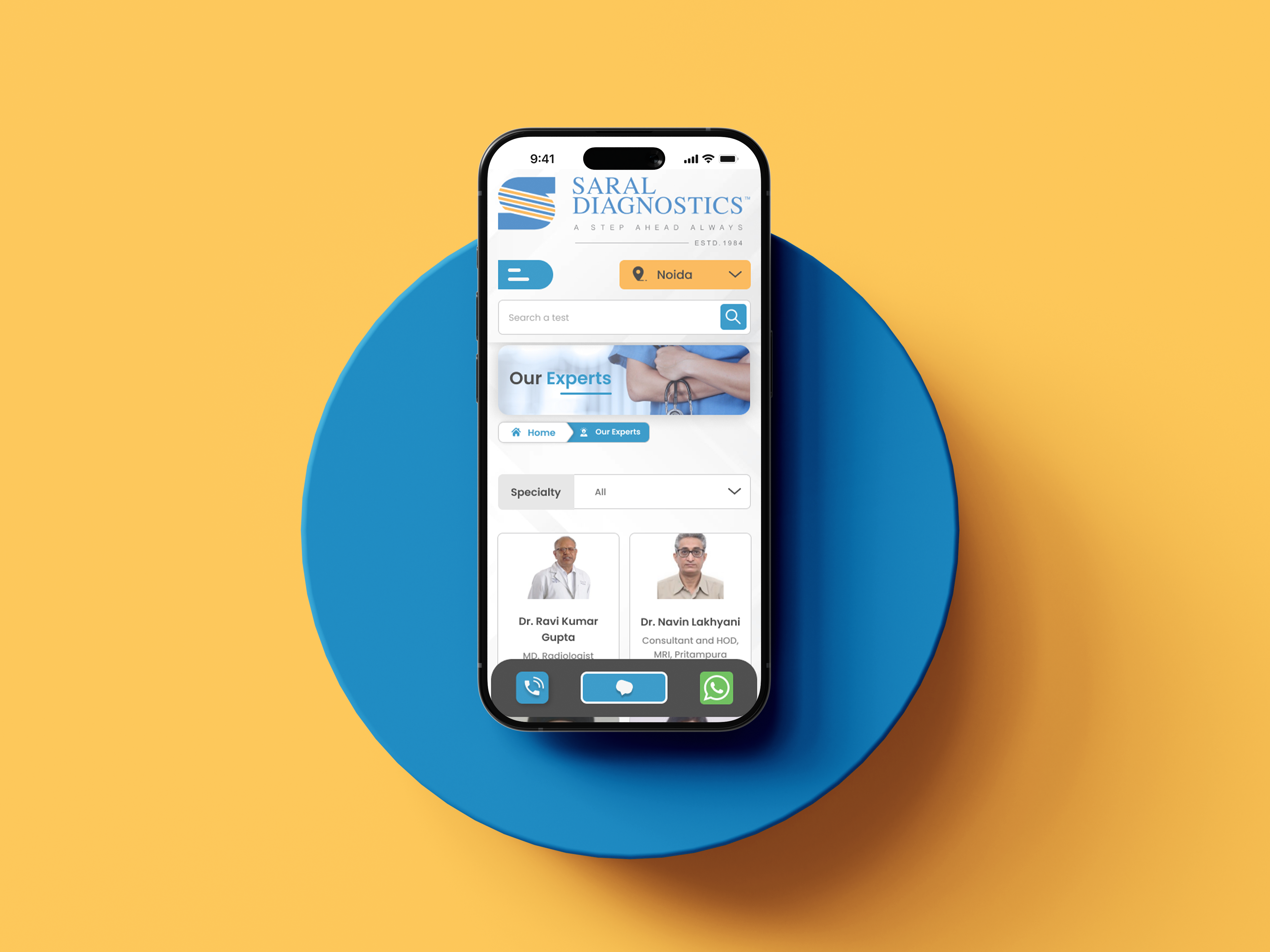
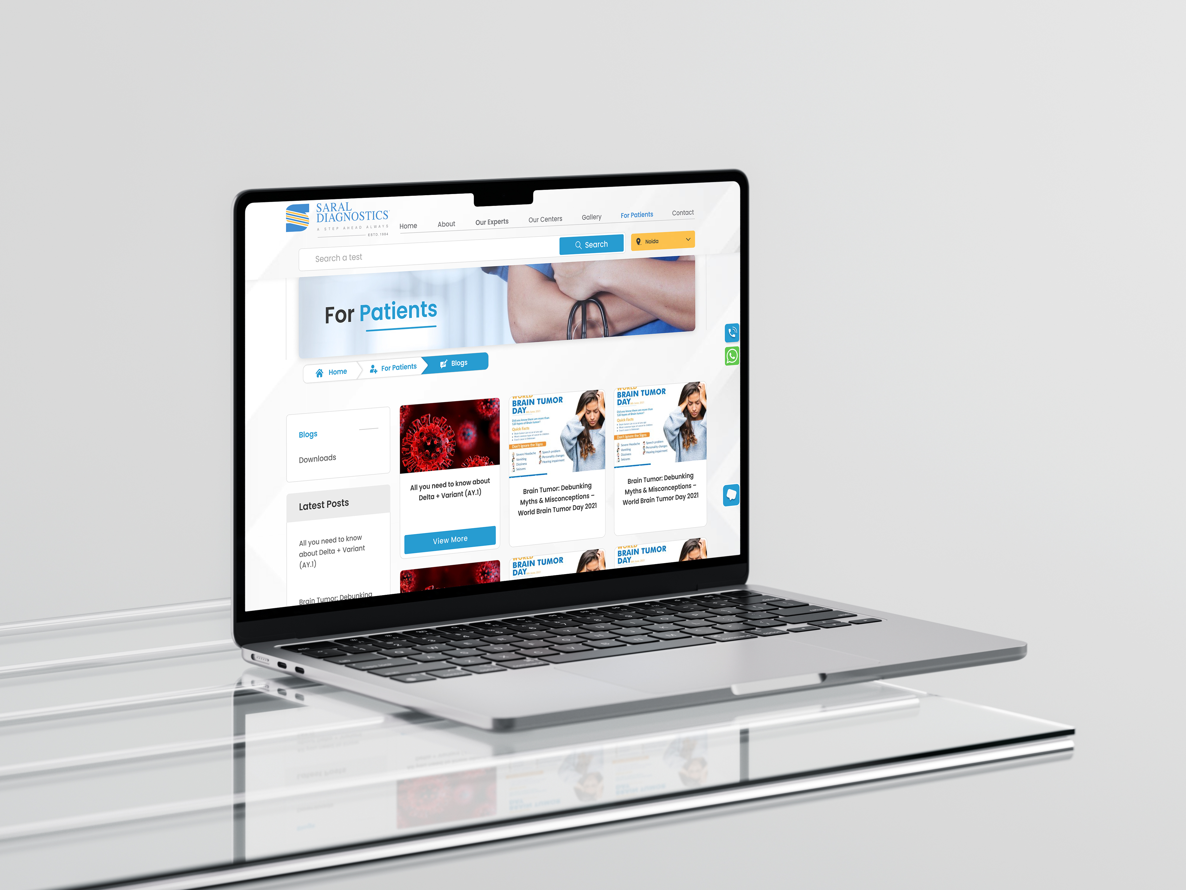
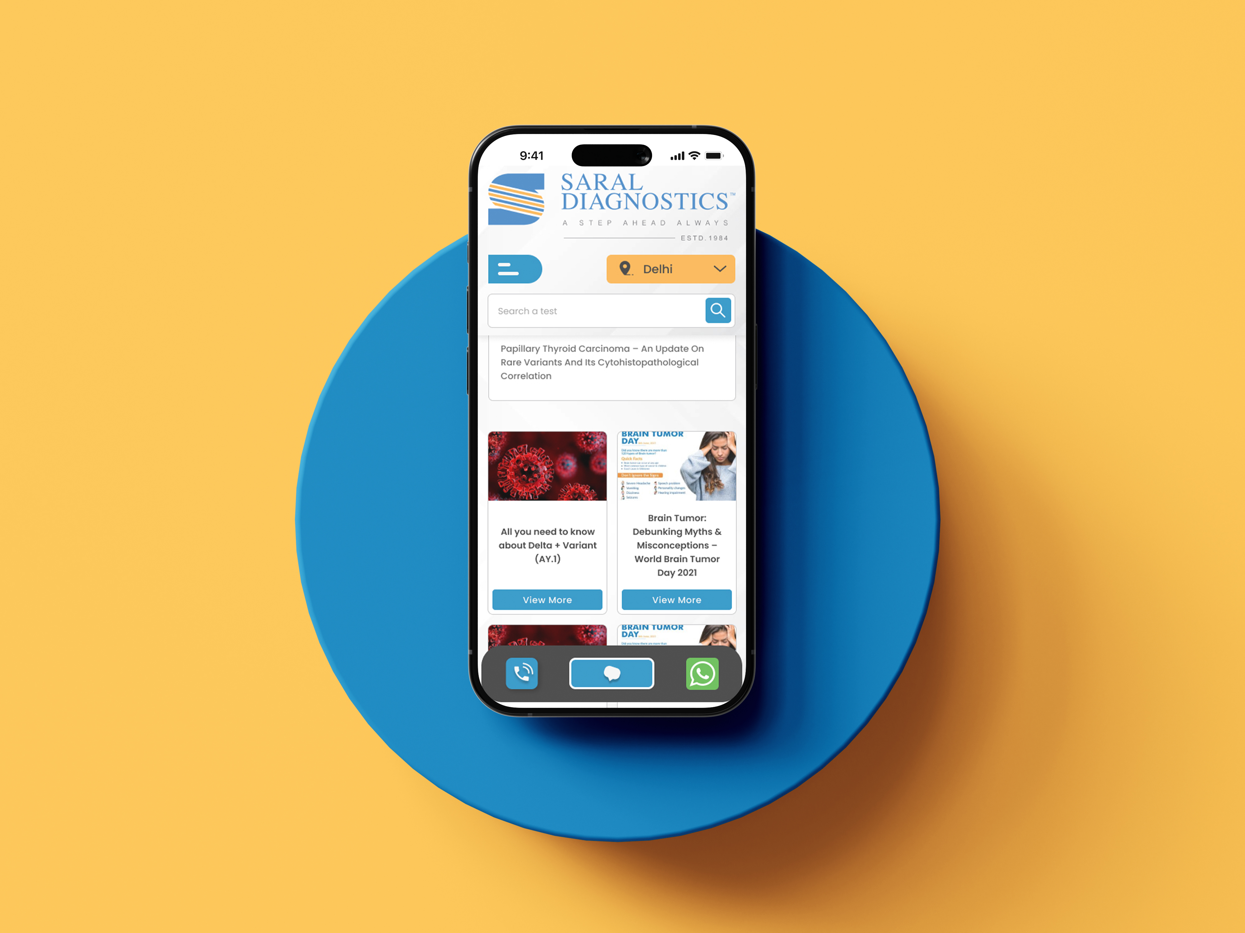
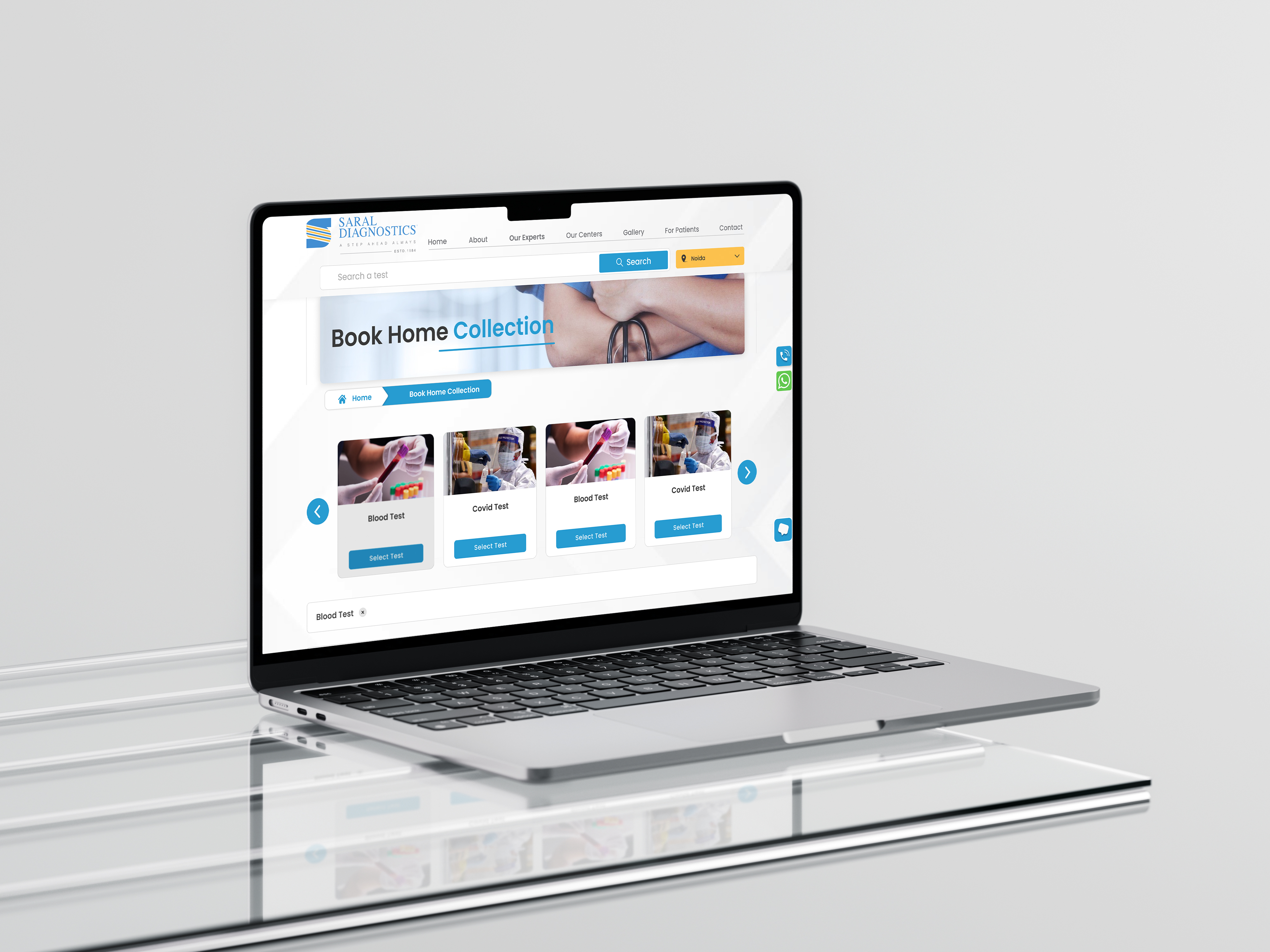
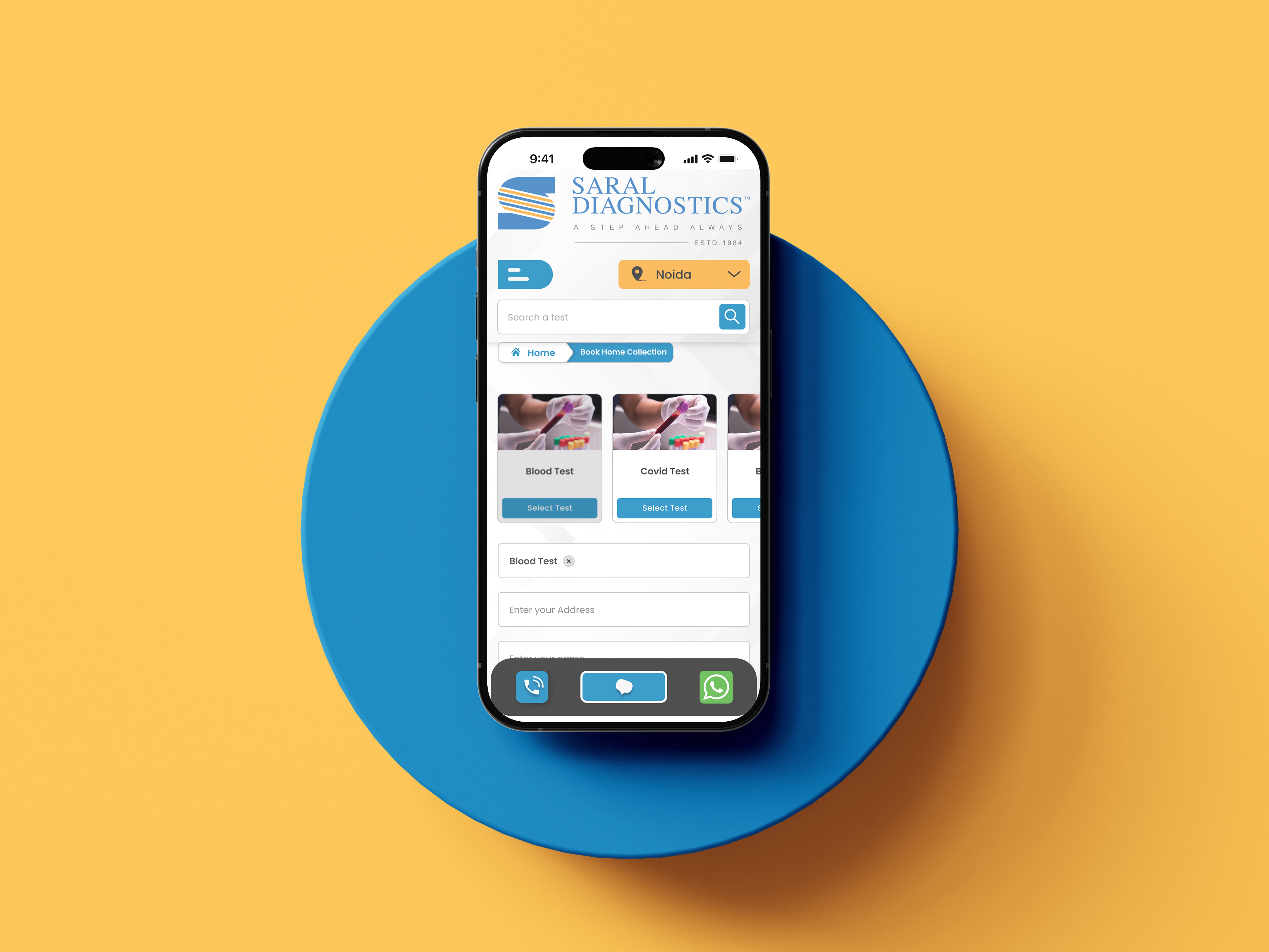
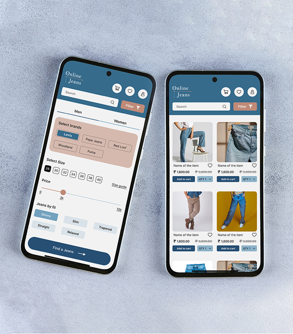
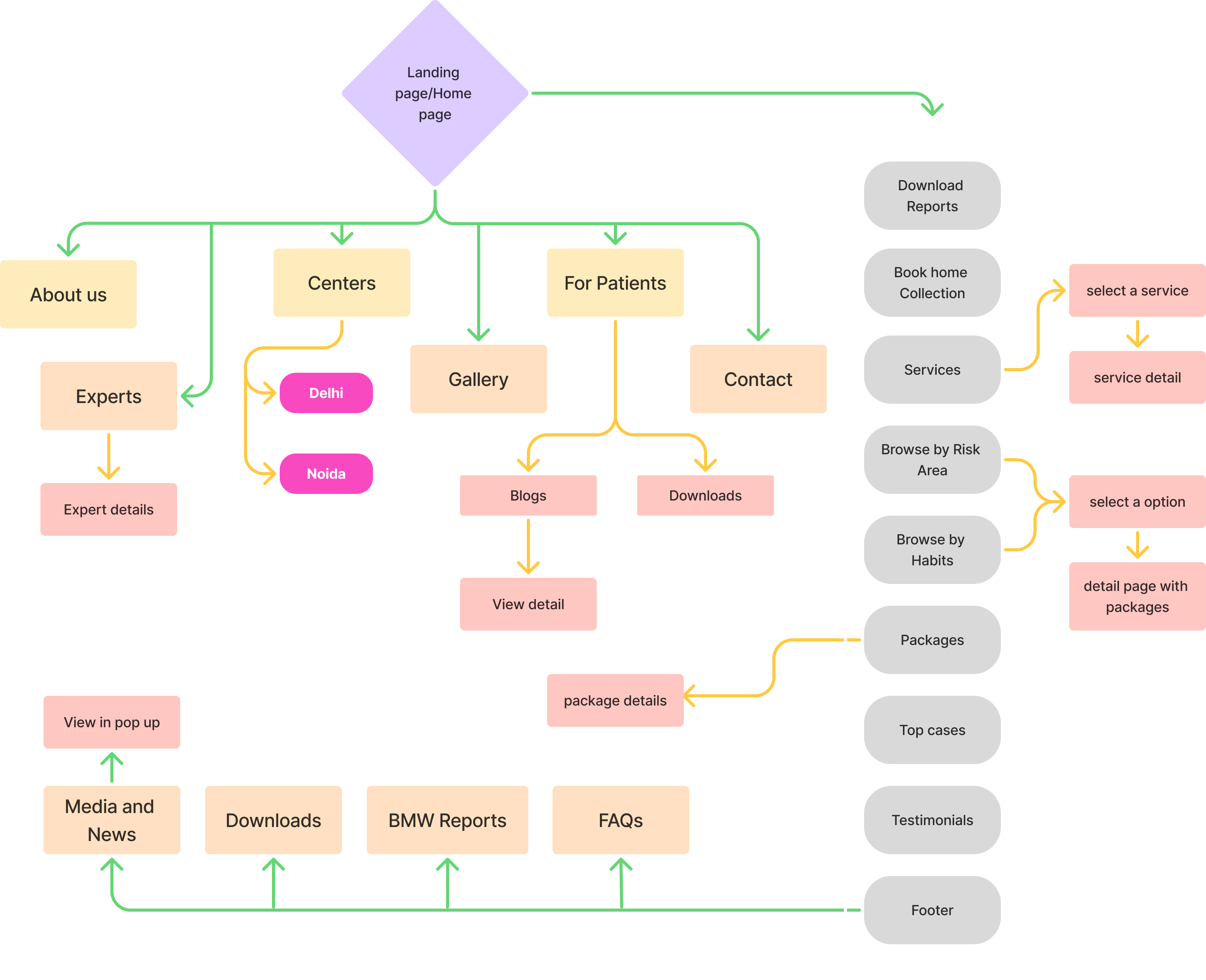
A diagnostic centre where test samples can be collected from home on online booking and patients can also download their reports from the website or app. That is, the app will be used either by the patient or someone connected to the patient (relative or friend).