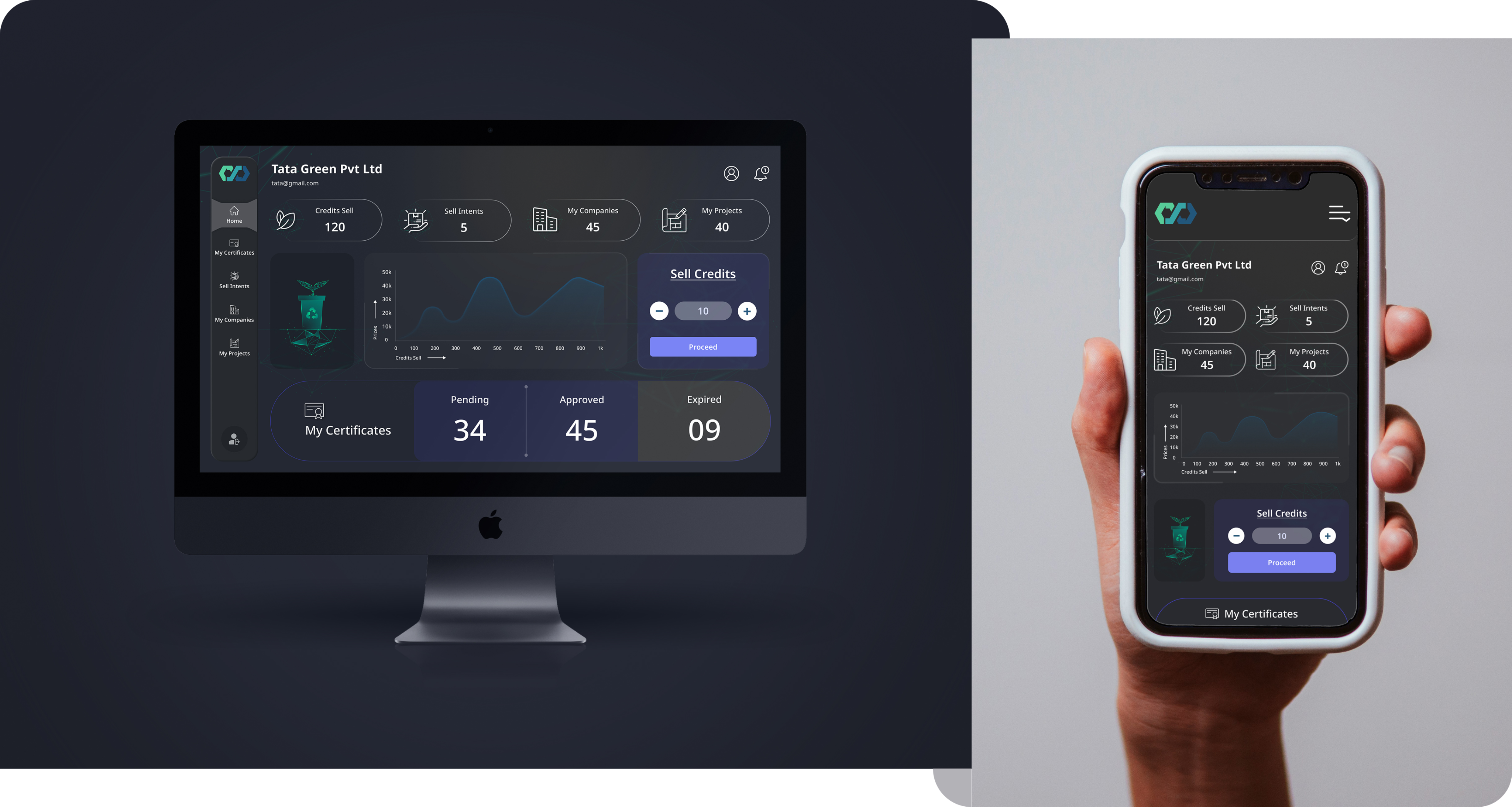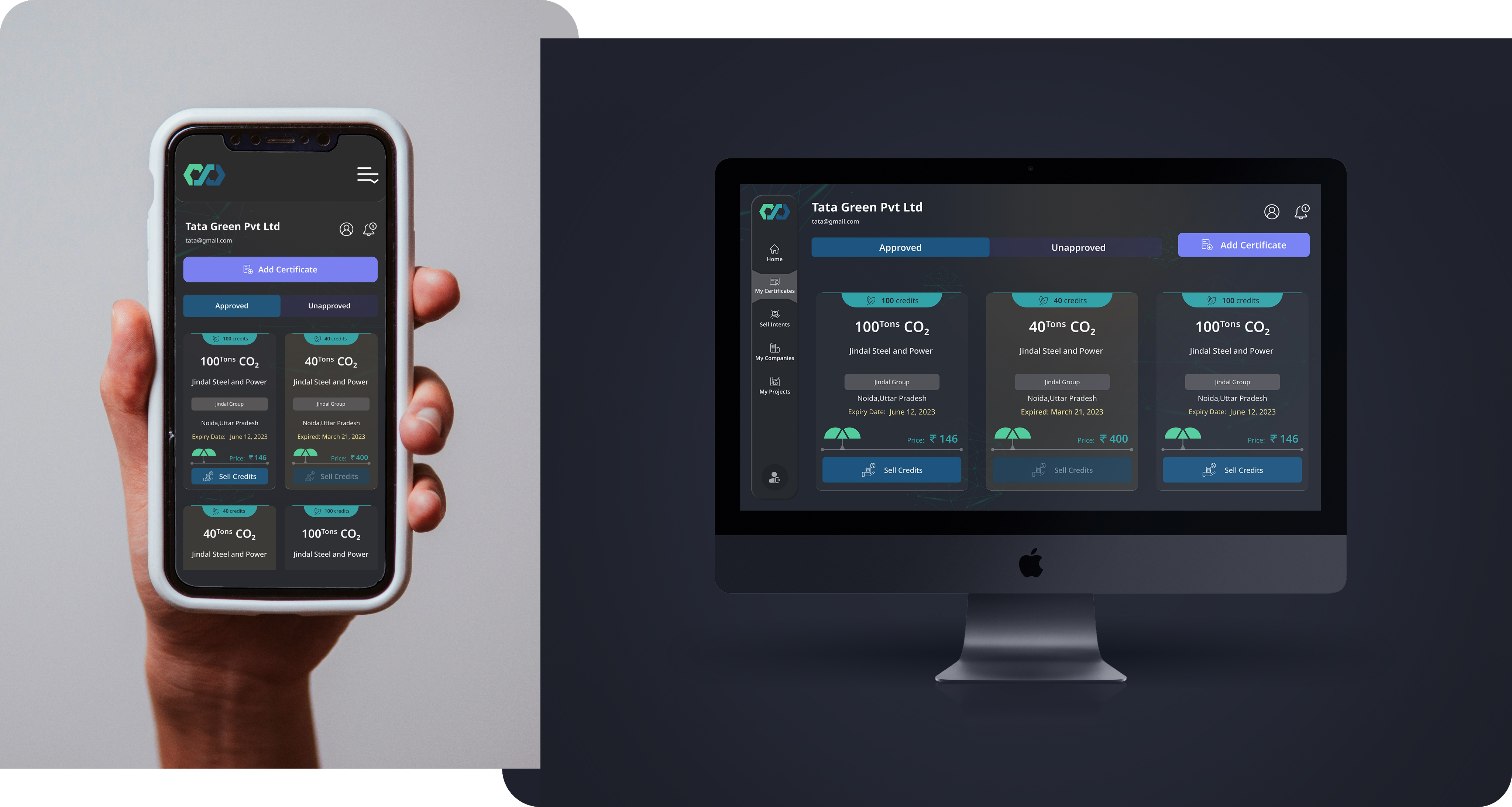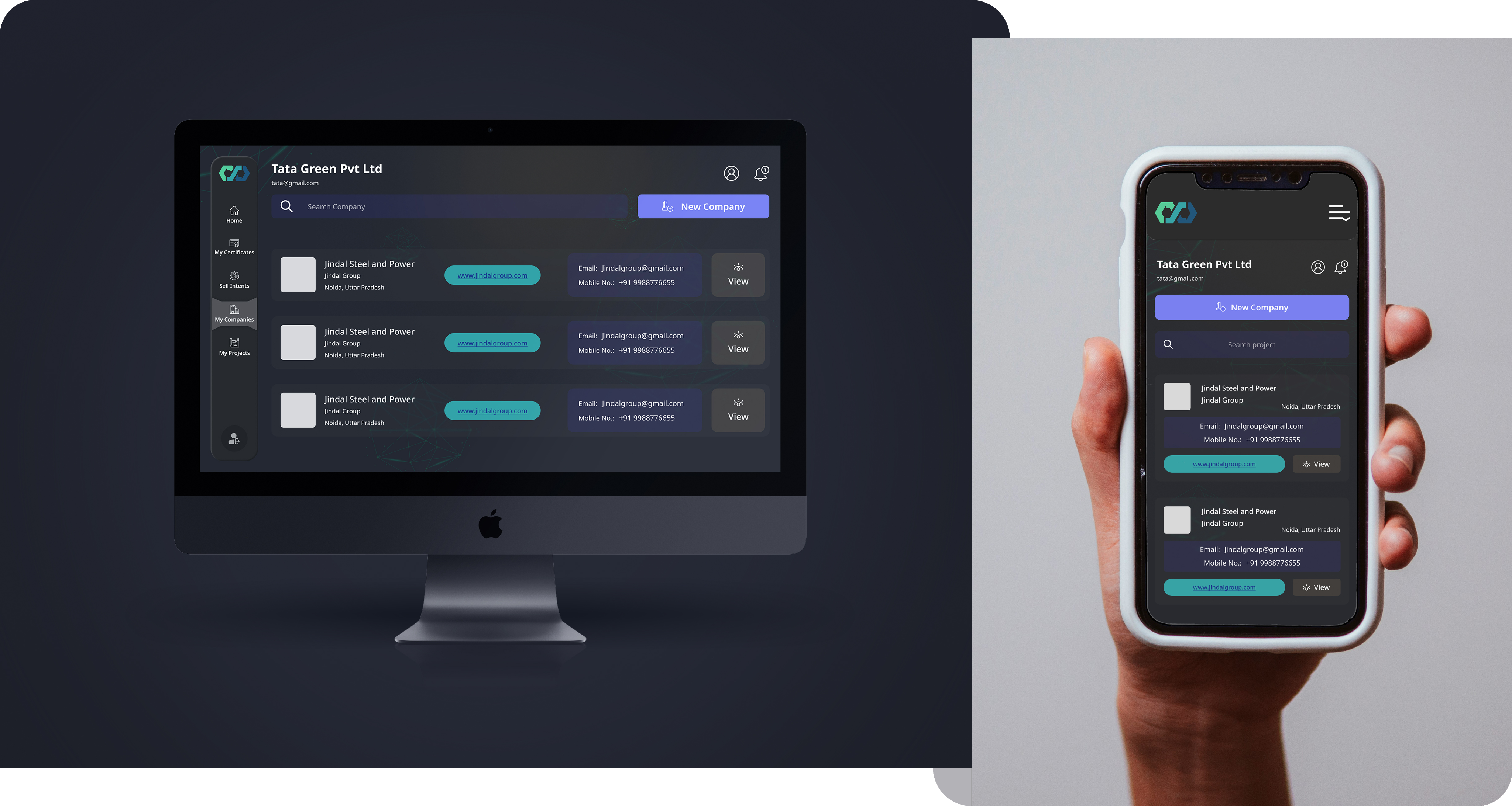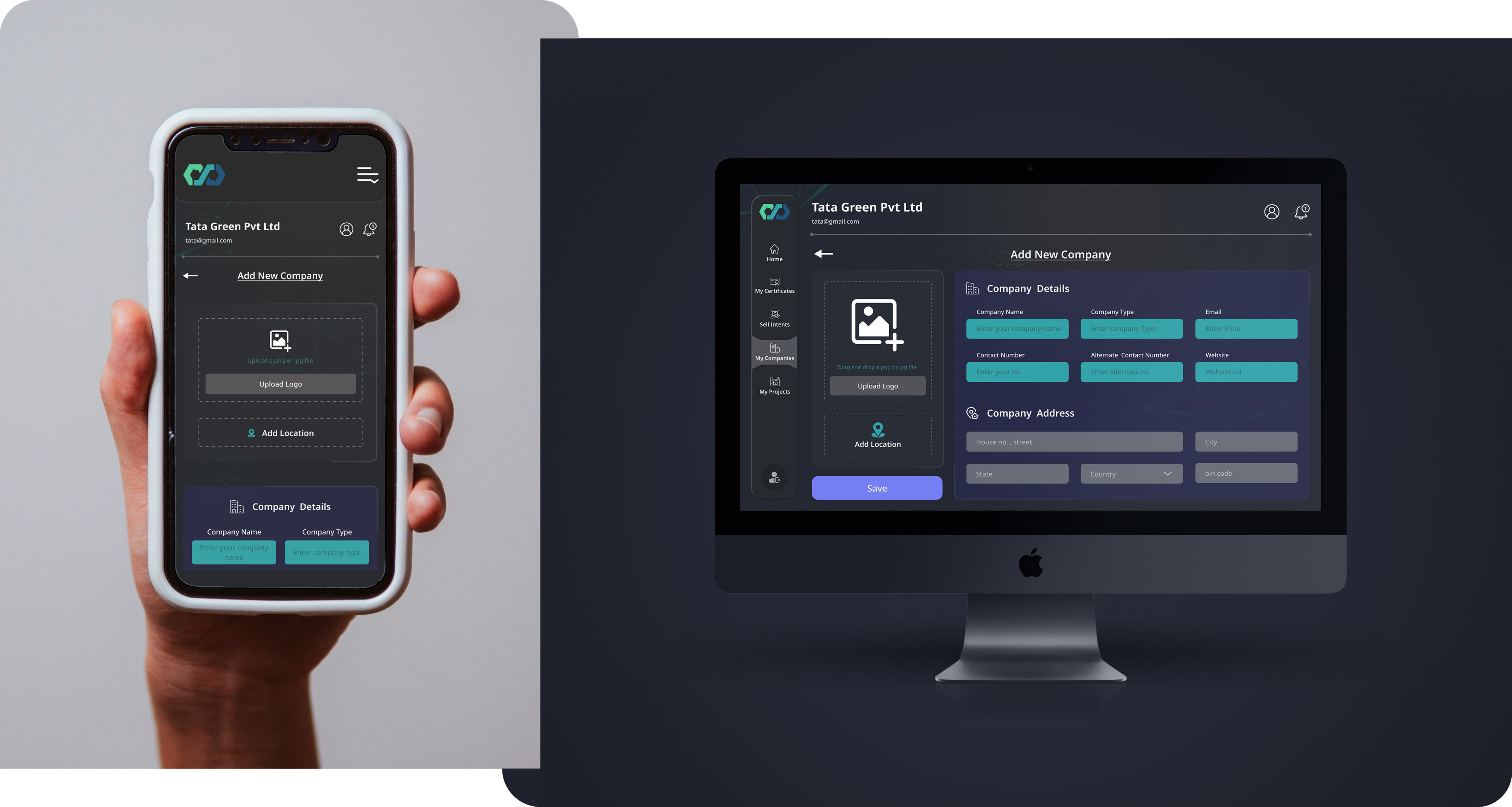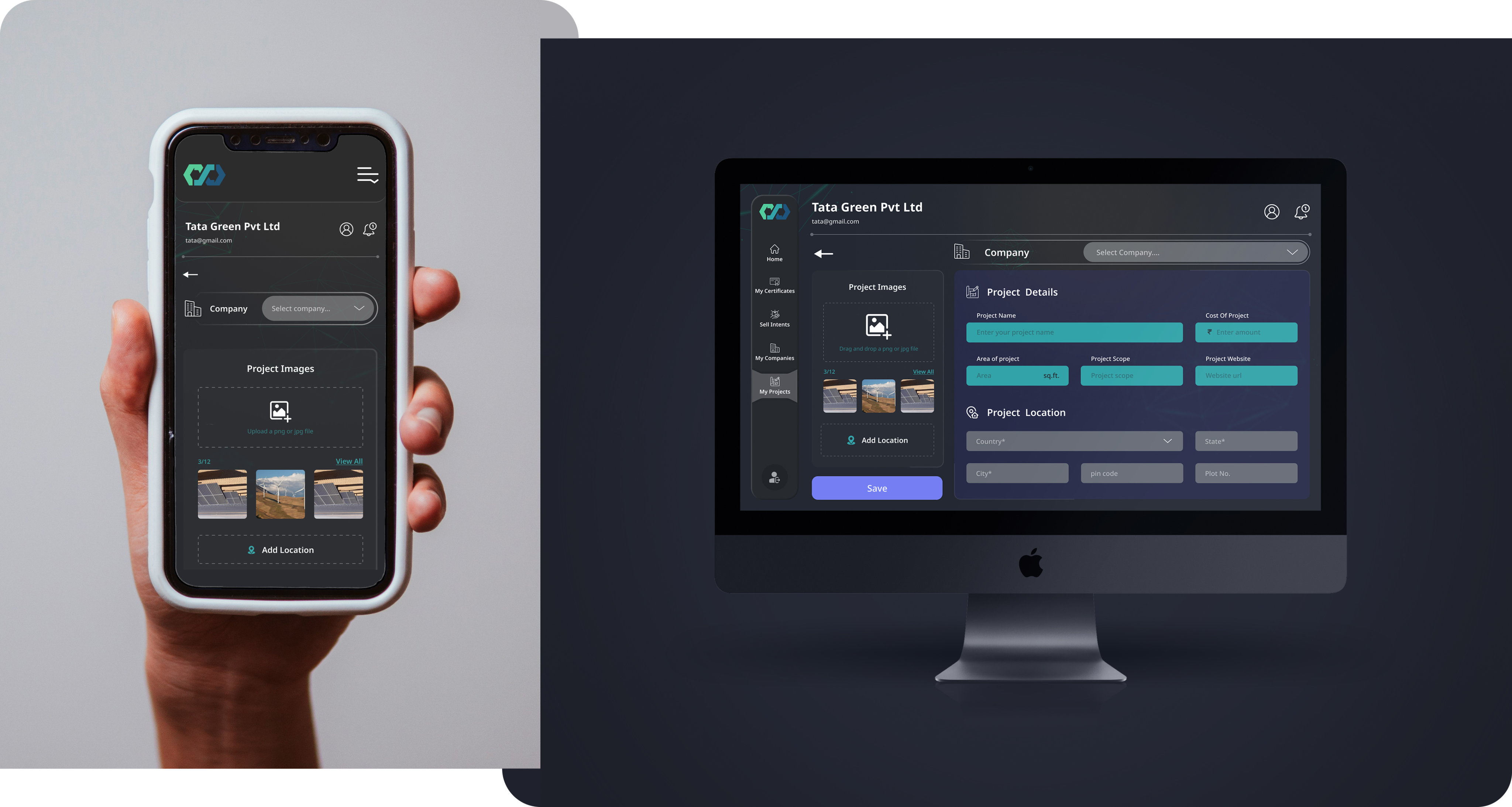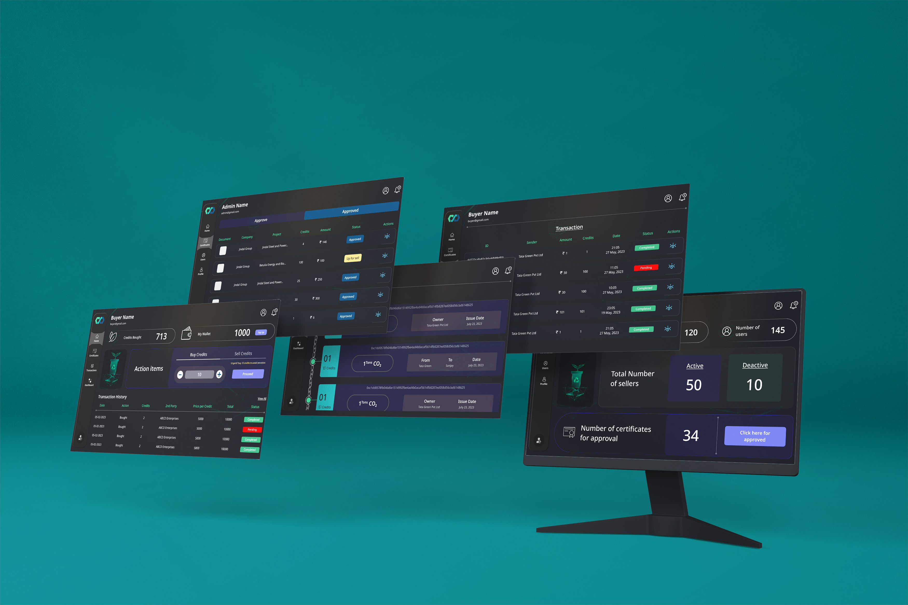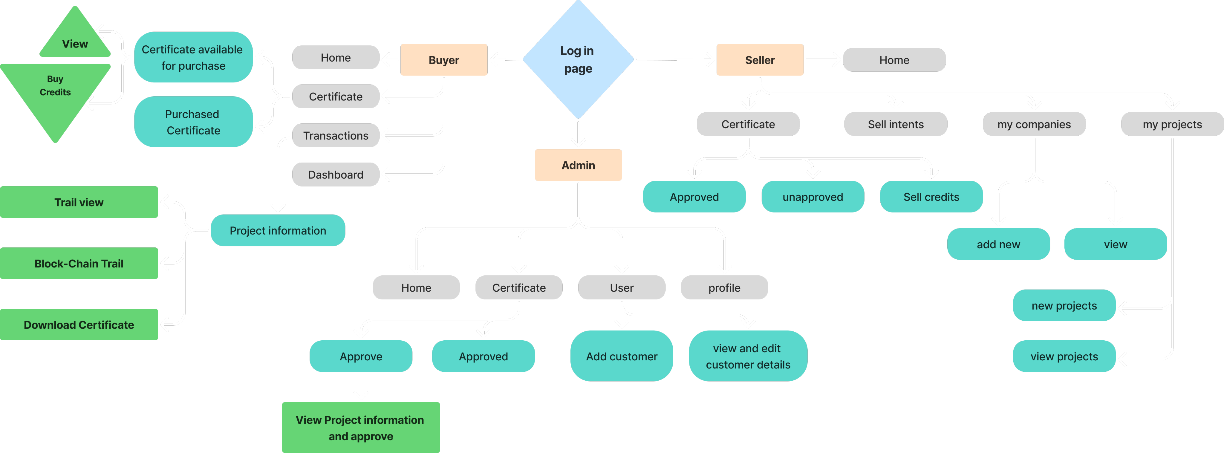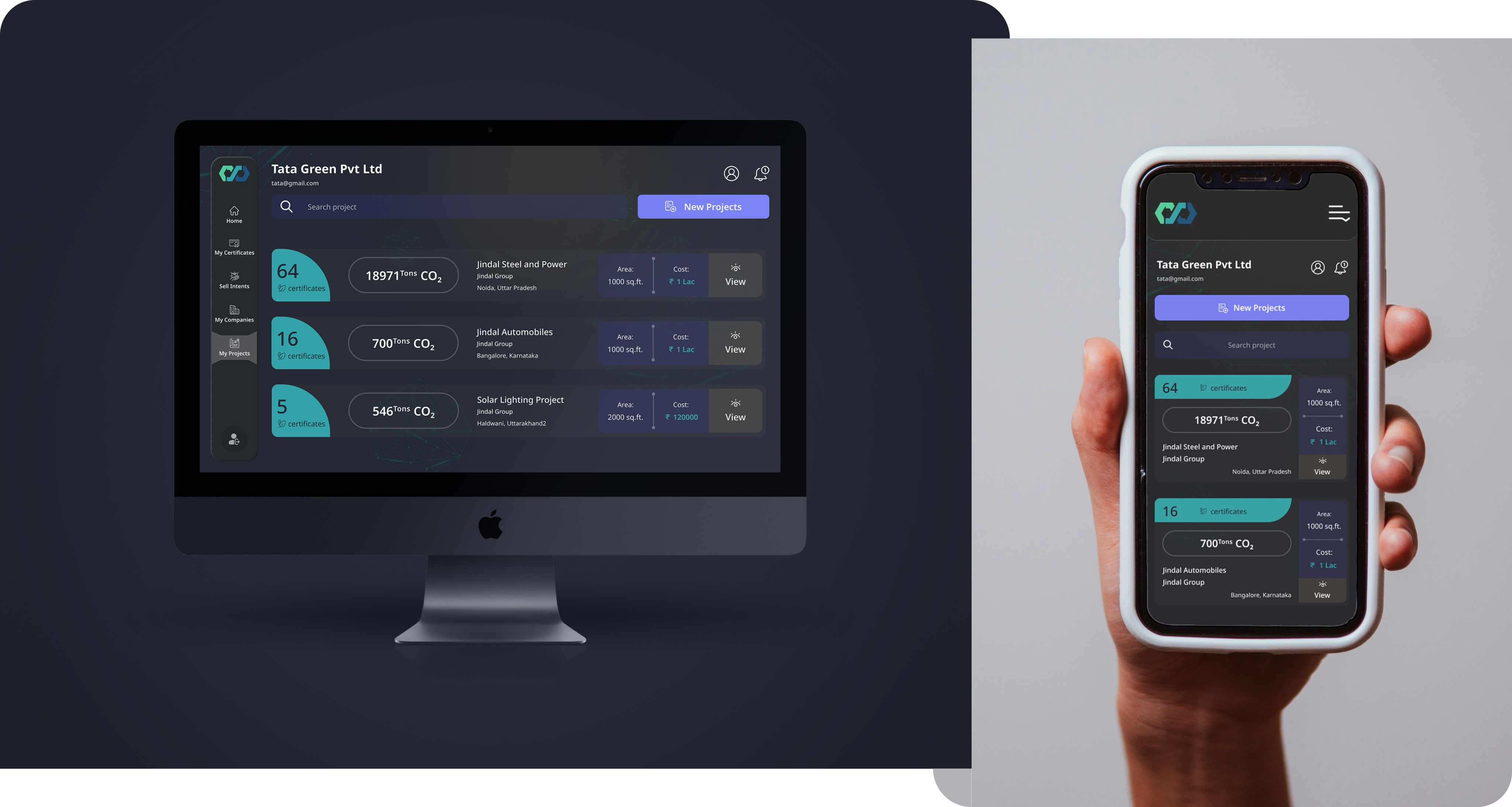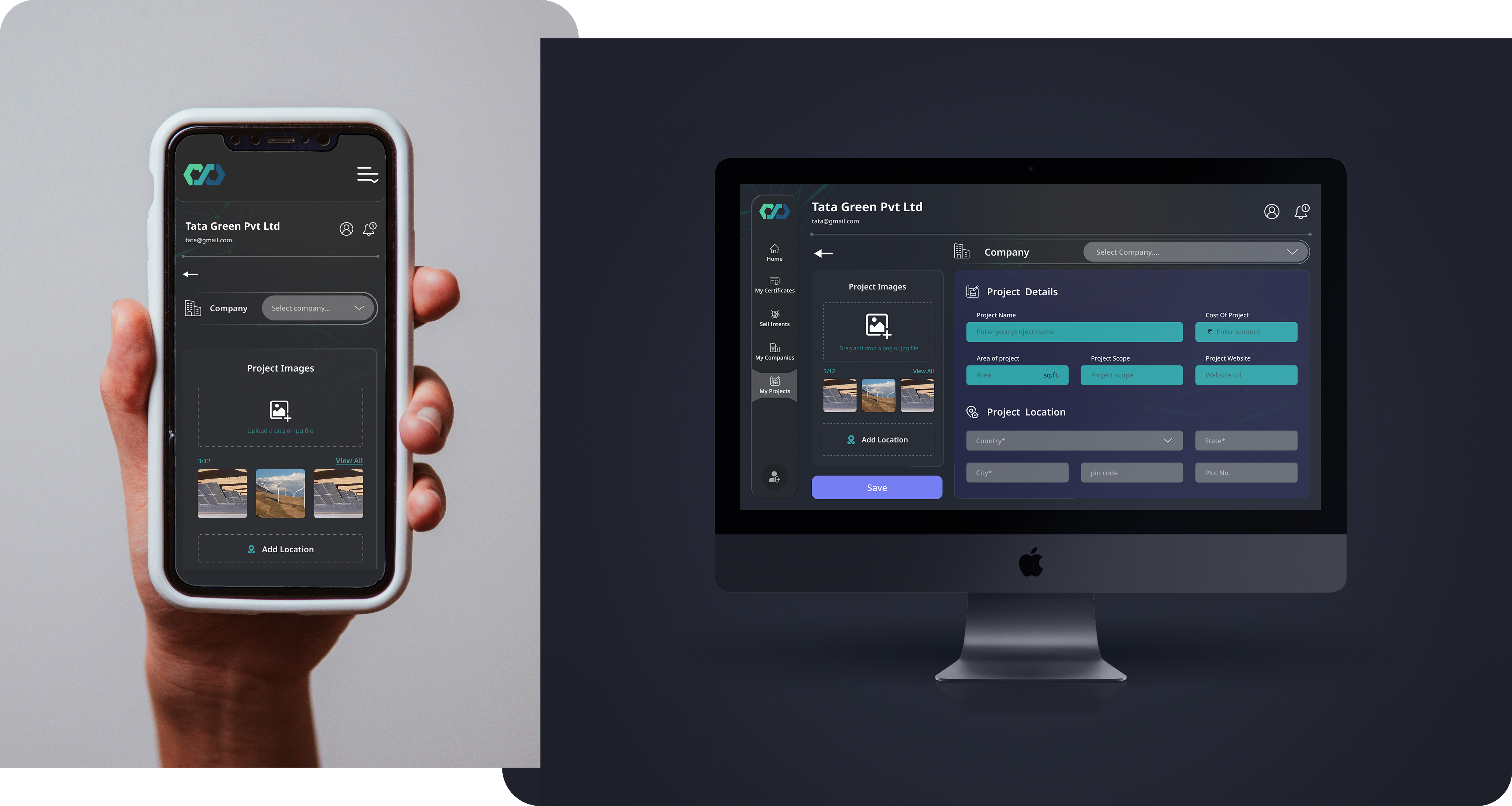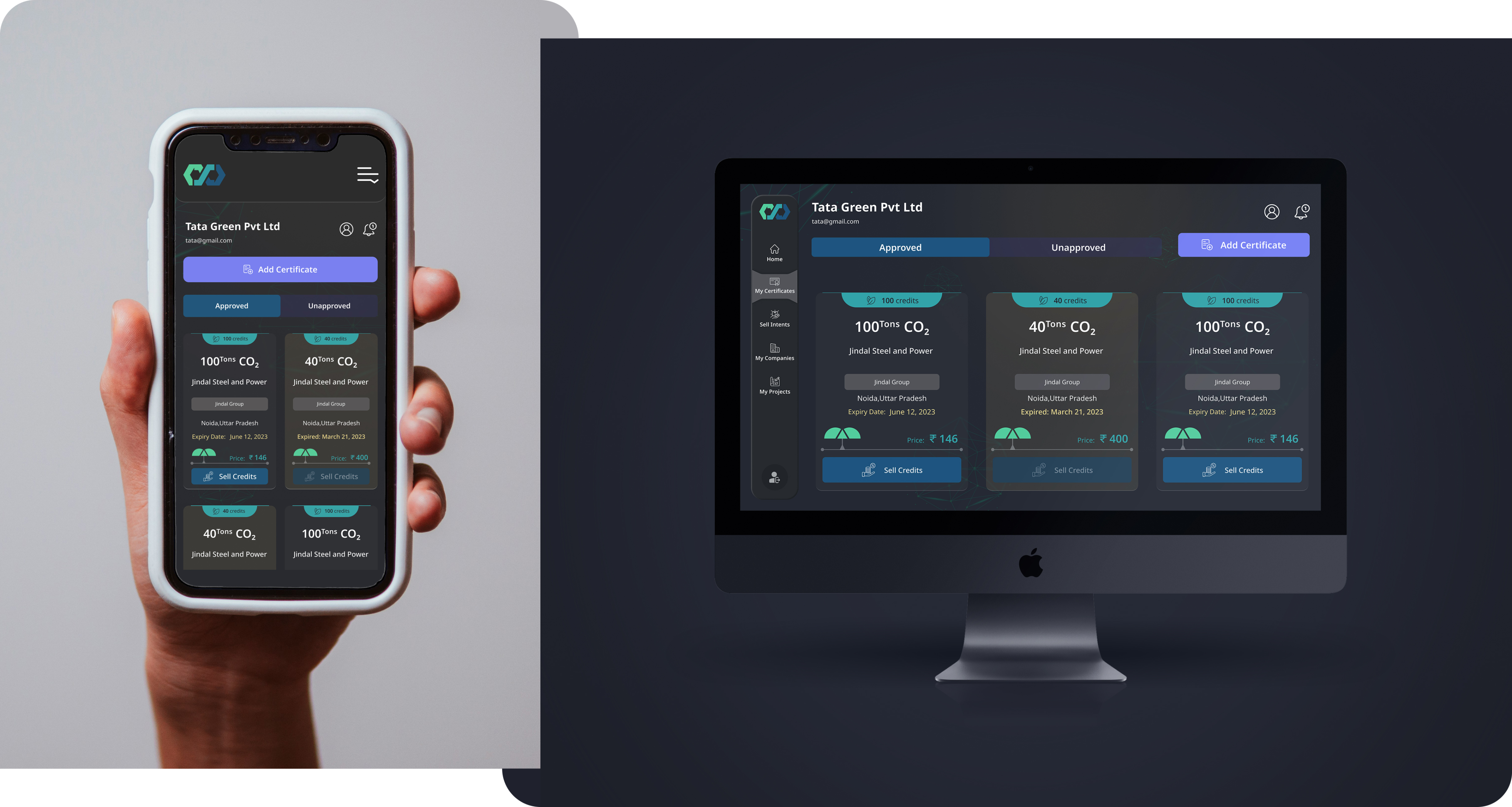


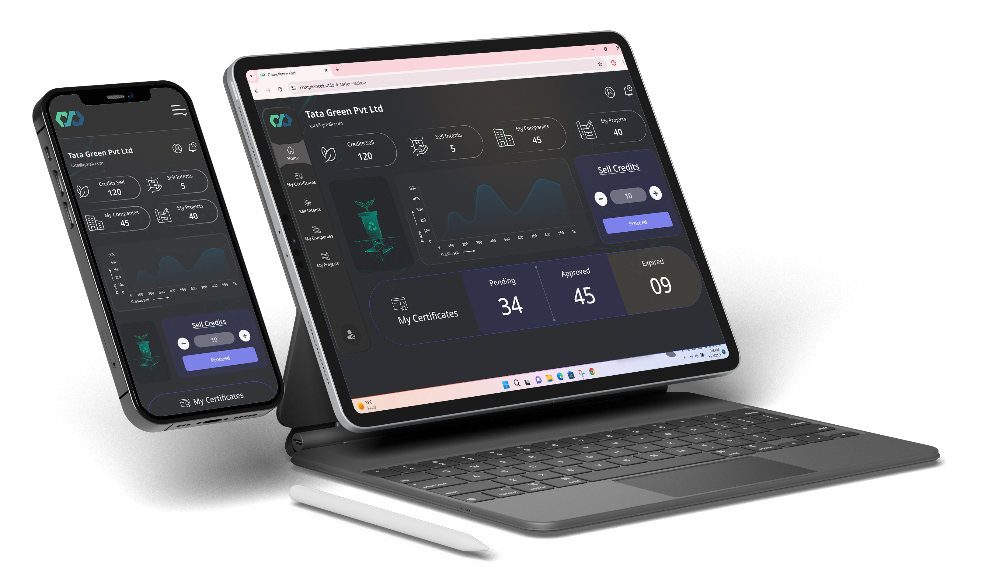
Compliance Kart is a digital platform that enables businesses, organizations, and individuals to trade and manage carbon credits with transparency and ease. The platform ensures credibility through verified carbon credits, offering solutions for emission tracking, reporting, and regulatory compliance

Industry:
Carbon exchange

Role:
UX Research & Design responsive UI

Tools:
Figma, FigJam & Adobe Photoshop
Overview
A carbon exchange company provides a digital marketplace where organizations, governments, and individuals can buy, sell, or trade carbon credits to offset greenhouse gas emissions. It acts as a bridge between entities generating carbon offsets (such as renewable energy projects, reforestation initiatives, or sustainable farming practices) and businesses seeking to meet their sustainability targets or regulatory requirements. By ensuring transparency, traceability, and compliance, carbon exchange platforms promote accountability in climate action while encouraging investment in green projects.